
High Quality Travel Posters vs Generic Prints: 2026 Guide
Table of Contents
- High Quality Travel Posters vs Generic Prints: What Actually Differs?
- Quick Comparison: Premium Prints vs Mass-Produced Posters
- Paper Weight and Finish: Why 200gsm Matte Beats Thin Glossy Stock
- Giclée vs Digital Print Quality: Ink, Resolution and Fade Resistance
- How to Check Print Colour Accuracy Before You Buy
- Artistic Authenticity: Original Artwork vs AI-Generated Fillers
- What £14.99 Buys You: A Closer Look at Premium Travel Posters
- The Verdict: When High Quality Travel Posters Are Worth the Extra Cost
- Frequently Asked Questions
Last Updated: September 9, 2026
High Quality Travel Posters vs Generic Prints: What Actually Differs?
The difference between high quality travel posters and generic prints is not subtle once you know what to look for, yet most buyers can't tell them apart until both arrive in the post. The vintage poster market is projected to grow at a compound annual growth rate of 6.1% between 2026 and 2034, according to Data Insights Reports' vintage poster market analysis, which means more sellers are entering the space with cheaper alternatives. At Pitch Black Print, we produce original destination artwork, and the gap between premium and mass-produced work has widened. This guide breaks down the physical and artistic differences so you can judge a print before you buy, not after.
The core distinction comes down to three things: the paper it's printed on, the printing method used, and whether the artwork itself is original or generated to fill a trend. Generic prints typically cut corners on all three. Below, we'll show you exactly how to spot the difference in under two minutes, starting with the most visible giveaway.
Quick Comparison: Premium Prints vs Mass-Produced Posters
Premium travel posters are printed on heavyweight matte paper using giclée methods, while generic prints usually arrive on thin glossy stock with visible pixelation. That single difference changes how the piece looks on your wall, how it holds colour over time, and how it feels in your hand.
| Feature | Premium Print | Generic Print |
|---|---|---|
| Paper weight | 200gsm+ heavyweight matte | 120-150gsm thin gloss |
| Print method | Giclée (pigment ink) | Digital (dye ink) |
| Artwork | Original, location-accurate | AI-generated or templated |
| Colour accuracy | Proofed before dispatch | Mass-produced, unverified |
| Fade resistance | Archival quality | Visible fading within years |
| Price point | £14.99+ | Often cheaper, rarely better |
The market has noticed. Industry analysis for 2026 shows design trends strongly favour high-quality printing and premium materials that enhance depth and durability, as FinerWorks' 2026 print trends report confirms. That's not a niche preference; it's where the entire sector is heading.
Paper Weight and Finish: Why 200gsm Matte Beats Thin Glossy Stock
Paper weight is the fastest way to judge a travel poster before you even unwrap it fully. A premium print typically uses 200gsm or heavier matte stock, which feels substantial and has a smooth, non-reflective surface. Thin glossy paper, often 120-150gsm, flexes easily, shows every fingerprint, and reflects light in a way that washes out the artwork.

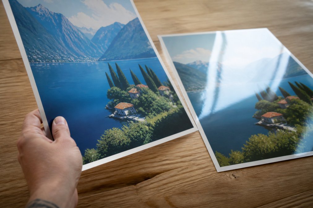
Matte finish matters more than most buyers realise. It eliminates glare under typical home lighting, which means the colours stay true whether the poster hangs opposite a window or beneath a ceiling spot. Glossy stock creates hotspots that shift the perceived colour depending on where you stand.
The depth this adds is measurable in how the piece feels. Sellers like MyRetroposter's guide to authentic travel posters emphasise that high-grade materials and geographic accuracy distinguish premium prints from generic versions, giving them archival-quality durability. A poster printed on thin stock may look acceptable in a product photo, but it will never deliver the same presence on your wall.
Giclée vs Digital Print Quality: Ink, Resolution and Fade Resistance
Giclée printing is a fine-art reproduction method that uses pigment-based inks sprayed at high resolution onto archival paper. It produces crisp detail, rich colour layering, and fade resistance measured in decades rather than years. Standard digital printing uses dye-based inks that sit on the surface of the paper, which is why generic prints can look slightly soft and lose colour noticeably within a few years of direct light exposure.
Resolution is the second half of the equation. Generic print-on-demand services often upscale small digital files, which introduces visible pixelation on large formats. A premium giclée print starts from a high-resolution master file, so the detail holds even at A2 or A1 sizes.
For a travel poster, this matters most in architectural detail. The intricate Gothic tracery of Big Ben or the suspension cables of Tower Bridge either render crisply or they blur into mush. When you're paying for a piece that commemorates a specific place, that accuracy is the entire point. As Posters and Prints' analysis of vintage travel aesthetics notes, increased demand for vintage-style travel posters has created a thriving market for high-quality reproductions, precisely because buyers want that detail preserved.

How to Check Print Colour Accuracy Before You Buy
Colour accuracy is the most common complaint from online art buyers, and it's almost always a production issue rather than a screen issue. The good news is you can check it before you order by looking at how the seller describes their proofing process.
- Look for sellers who state prints are inspected before dispatch. If colour accuracy isn't mentioned, it likely isn't checked.
- Check whether the listing acknowledges screen variation. Honest sellers note that colours can vary slightly between screens and the finished print.
- Review photos of the print in a real room, not just isolated product shots on white backgrounds.
- Confirm the paper type. Matte paper holds colour differently from glossy, and a seller who specifies the stock usually controls the process.
- Read reviews that mention colour specifically. "Matches the photo" is a strong signal.
Sellers who specialise in original artwork rather than mass-produced templates tend to have tighter quality control. Expert guidance for 2026 suggests that posters sold directly by artists or specialised curators offer superior quality control compared to generic print-on-demand marketplaces, which often lack the same oversight, as Filipp Jenikae Art's guide to unique posters explains.
Artistic Authenticity: Original Artwork vs AI-Generated Fillers
The artwork itself is where the market has become most crowded. Some sellers report that the travel poster space is filling with "busy" designs that lack artistic focus, creating a perception of generic quality across the category. AI models often replicate trends like oversaturated colours, which can replace genuine creativity with mass-produced, generic visuals.
Original artwork carries intent. A human illustrator decides which landmarks to feature, how to compose the scene, and which colour palette evokes the right mood. That decision-making is what makes a poster feel like a place you visited rather than a picture of a place.
This is why categorisation matters. Some sellers now distinguish between originals, reprints, reissues, and reproductions to educate buyers on value and authenticity, as PropellerPropaganda's poster categorisation guide outlines. Understanding which category you're buying helps you judge whether you're investing in a considered piece of art or a decorative reproduction.
What £14.99 Buys You: A Closer Look at Premium Travel Posters
At £14.99, a premium travel poster from Pitch Black Print includes original destination artwork, professional printing on heavyweight matte paper, and your choice of poster-only or framed formats in black, white, or oak.
The material difference shows immediately. Our Tower Bridge London Vintage Travel Poster, for example, is rendered in rich navy, amber, and crimson tones with classic vintage typography. The paper-cut style pieces layer deep purples and burnt oranges with intricate architectural detail that only survives on premium stock. Each print is made to order and inspected before dispatch, and free worldwide shipping is included with no surprise charges at checkout.
Framing options matter more than most buyers expect. A poster-only purchase gives renters flexibility, while a professionally framed piece in oak or black arrives ready to display. The 14-day return policy covers both formats, so you can see the print in your own lighting before committing.
The Verdict: When High Quality Travel Posters Are Worth the Extra Cost
High quality travel posters are worth the extra cost whenever the piece is meant to last, whether that's a gift for someone returning from Japan or a centrepiece for your own living room. The difference between premium and generic is not a marketing illusion; it's a measurable gap in paper weight, print method, colour accuracy, and artistic intent.
Generic prints have their place. If you want a temporary decoration or a throwaway gift, a £5 print from a marketplace will cover the wall. But if you're commemorating a specific trip, curating a gallery wall, or buying for someone who values design, the premium option delivers a piece that looks better, lasts longer, and carries meaning.
The vintage poster market's sustained growth reflects this shift toward quality. Buyers are increasingly educated, and they're choosing prints that honour the places they love rather than generic approximations.
Choosing between premium and generic travel posters comes down to what you want the art to do. If it's a meaningful reminder of a place you've been, a considered gift, or a piece that will hold its colour and detail for years, high quality travel posters justify their price through materials, method, and original artwork. Pitch Black Print offers original destination posters from £14.99 with free worldwide shipping, a 14-day return policy, and framing options in black, white, or oak. Get started with Pitch Black Print and bring the spirit of your favourite places into your home.
Frequently Asked Questions
How can you tell if a travel poster is high quality?
Check the paper weight and finish first. Premium travel posters use heavyweight matte paper, typically 200gsm or above, which prevents show-through and gives a non-reflective surface. Look closely at fine details like architectural lines: high quality posters keep them crisp, while generic prints often look soft or pixelated. The colours should be rich and accurate to the original artwork. On Pitch Black Print posters, the print is made to order on premium heavyweight matte paper and inspected before dispatch, which is why details stay sharp.
What is the difference between giclée printing and standard digital printing?
Giclée printing uses pigment-based inks sprayed in fine droplets, producing a wider colour gamut and better fade resistance than standard digital printing, which often uses dye-based inks. For travel posters, giclée matters most for colour accuracy: it holds subtle gradients in sunsets and skies without banding. Standard digital prints can look acceptable initially but tend to fade or shift colour within a couple of years, especially in bright rooms. If you want a poster that keeps its depth for decades, giclée is the safer choice.
Why do generic prints often fade or discolour over time?
Generic prints typically use dye-based inks on lightweight coated paper. Dye molecules break down faster when exposed to UV light, causing colours to fade unevenly, often leaving a yellow or pink cast. The paper itself may also be acidic, which yellows with age. High quality travel posters use pigment-based inks and archival-grade or acid-free paper, which resist UV damage. That is why a premium poster can look as vivid in ten years as the day it arrived, while a generic print may need replacing within two or three.
What paper weight is best for professional travel posters?
For professional travel posters, look for 200gsm to 300gsm heavyweight matte paper. Below 150gsm, posters feel flimsy, curl at the edges and can show ink bleeding through from the reverse side. Matte finishes at this weight reduce glare, so colours stay accurate under spotlights or near windows. Heavier paper also frames better, lying flat without ripples. Pitch Black Print uses premium heavyweight matte paper across its range, which is why the prints hold their shape and colour whether displayed loose in a frame or pinned to a gallery wall.
How does print resolution affect the appearance of travel wall art?
Print resolution determines how sharp fine details appear. Low-resolution images, often from stock libraries or AI generators, look acceptable on a phone screen but show jagged edges and blur when printed at A3 or larger. High quality travel posters are printed from vector-based or high-MP artwork, so lines stay crisp at any size. The Tower Bridge paper cut print, for example, keeps its layered architectural detail sharp even at 60 x 90cm. If a seller cannot state their source resolution, assume it is too low for large-format printing.