
How to Check Print Colour Accuracy: A 2026 Guide
Table of Contents
- Why Print Colour Accuracy Is Harder Than It Looks
- RGB vs CMYK Colour Profiles: The Root of Most Mismatches
- Monitor Calibration for Print: Your First Practical Step
- Soft Proofing in Design Software Before You Send to Print
- Step-by-Step: How to Check Print Colour Accuracy
- Common Mistakes That Undermine Print Colour Accuracy
- What to Expect From a Quality Print Provider
- Frequently Asked Questions
Last Updated: September 1, 2026
Why Print Colour Accuracy Is Harder Than It Looks
Print colour accuracy is the degree to which a finished printed piece matches the intended colours defined in the original digital file. Getting it right consistently is far more difficult than most people expect, and the consequences of getting it wrong are more costly than a reprint.
According to research from Modern Mail's 2026 brand consistency analysis, consistent brand presentation has been linked to revenue lifts of up to 23-33%. For art prints in particular, where the entire product is the visual, a colour mismatch is not a minor inconvenience. It is a failed product.
At Pitch Black Print, we work with travel poster artwork where colour fidelity is everything. The warm amber of a Moroccan sunset or the deep indigo of a Kyoto evening cannot be approximated. They need to be right. Below, we will walk you through exactly how to check print colour accuracy at every stage of your workflow, from file preparation through to evaluating the physical output under correct lighting.
The problem is structural. Screens emit light; paper reflects it. These are fundamentally different physical processes, and they produce fundamentally different colour results. Most guides gloss over this tension and jump straight to calibration tips. That is the wrong starting point.
RGB vs CMYK Colour Profiles: The Root of Most Mismatches
The single most common cause of print colour disappointment is a colour profile mismatch between the source file and the print process.
RGB (Red, Green, Blue) is an additive colour model used by screens. It creates colour by combining light, and its gamut is enormous. According to Wayo Blog's 2026 colour gamut analysis, RGB can produce over 16 million colour shades. CMYK (Cyan, Magenta, Yellow, Black) is a subtractive model used by printers. It creates colour by layering inks on a reflective surface and can reproduce roughly 16,000 shades. That gap explains almost every "the print looks nothing like the screen" complaint.
What Happens When You Send an RGB File to Print
When you send an RGB file to a printer without converting it first, the printer's raster image processor performs an automatic conversion. This conversion uses generic, uncalibrated assumptions. Vibrant blues shift towards purple. Saturated greens become muddy. Neon or screen-optimised colours, which sit entirely outside the CMYK gamut, get clipped to the nearest printable equivalent.
The result is a print that looks dull, shifted, or flat compared to what you saw on screen. This is not a printer fault. It is a workflow fault, and it is entirely preventable.
How to Convert Without Losing Colour Fidelity
The fix is to control the RGB-to-CMYK conversion yourself, before the file leaves your hands.
- Open your file in professional design software such as Adobe Photoshop or Illustrator
- Navigate to Edit > Convert to Profile
- Select a destination profile appropriate for the print process: ISO Coated v2 300% (ECI) for coated stock, or ISO Uncoated v2 for uncoated paper
- Set the rendering intent to Perceptual for photographic images, or Relative Colorimetric for flat graphics and logos
- Inspect the converted file carefully. Any colours that have shifted significantly were outside the CMYK gamut to begin with
A common mistake is using the wrong output intent for the substrate. A profile built for coated gloss paper will produce noticeably different results on an uncoated or silk stock, even from the same press.
Monitor Calibration for Print: Your First Practical Step
Monitor calibration for print is the process of adjusting your display so that the colours it shows correspond accurately to a known, standardised reference. Without it, you are making colour decisions based on a screen that may be running warm, cool, too bright, or shifted in hue without your knowledge.
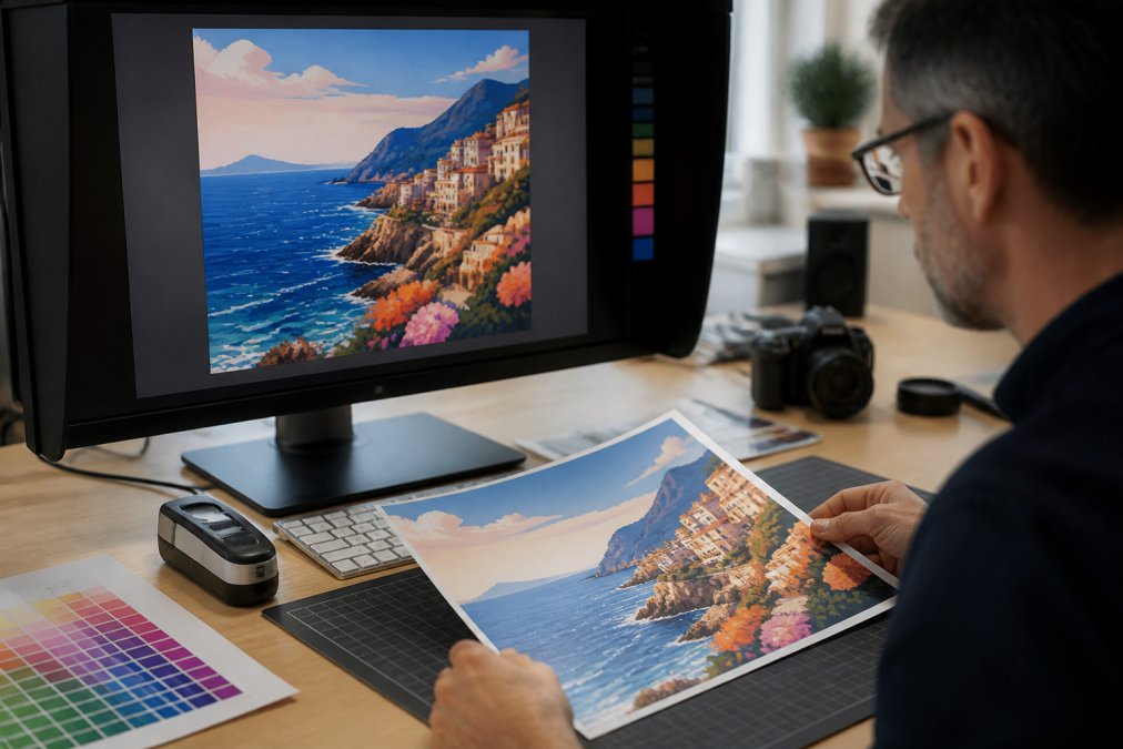
Most uncalibrated monitors drift significantly within six months of use. A display that looked accurate when new may now be showing you a version of your artwork that is 15-20% brighter than it will print, or skewed towards blue. Every creative decision made on that screen is being made on false information.
Hardware Colorimeters vs AI-Assisted Auto-Calibration
Two approaches now exist for achieving a calibrated display.
Hardware colorimeters are physical devices that attach to your screen and measure its actual colour output against a reference standard. They then generate a custom ICC profile that corrects for your specific display's characteristics. Devices from X-Rite and Datacolor remain the professional standard. According to TechHQ's 2026 report on print accuracy technologies, the X-Rite i1Profiler measurement ecosystem can cut calibration measurement time by up to 50% while improving accuracy, capturing M0, M1, and M2 data in a single scan.
AI-assisted auto-calibration is a newer approach built into high-end displays. As of 2026, these systems use onboard neural processing to predict and correct colour drift automatically, without a separate device. For most digital-only workflows, the results are now comparable to entry-level hardware calibration.
For print work, the recommendation is clear: use a hardware colorimeter. AI auto-calibration is excellent for screen-to-screen consistency, but print workflows require a verified ICC profile tied to a physical measurement. That still requires hardware.
Soft Proofing in Design Software Before You Send to Print
Soft proofing is the process of simulating, on your calibrated monitor, how a file will appear when printed on a specific press with a specific ink and substrate combination. It is the closest you can get to seeing the final print before committing to it.
The process works by applying a printer's ICC profile to your on-screen preview. Your design software, using your calibrated monitor's profile, then renders what that combination will look like in print. The result is not a perfect prediction, but it is far more accurate than simply looking at an uncorrected RGB display.
In Adobe Photoshop, go to View > Proof Setup > Custom, then select the output profile for your intended print process. Enable Simulate Paper Colour to see how the white point of the substrate will affect your image. This last step often surprises people. What looks like a clean white on screen will render as a warm cream or a cool grey depending on the paper.
Soft proofing will not catch every issue, but it will flag the most significant gamut mismatches before they become expensive physical misprints.
Step-by-Step: How to Check Print Colour Accuracy
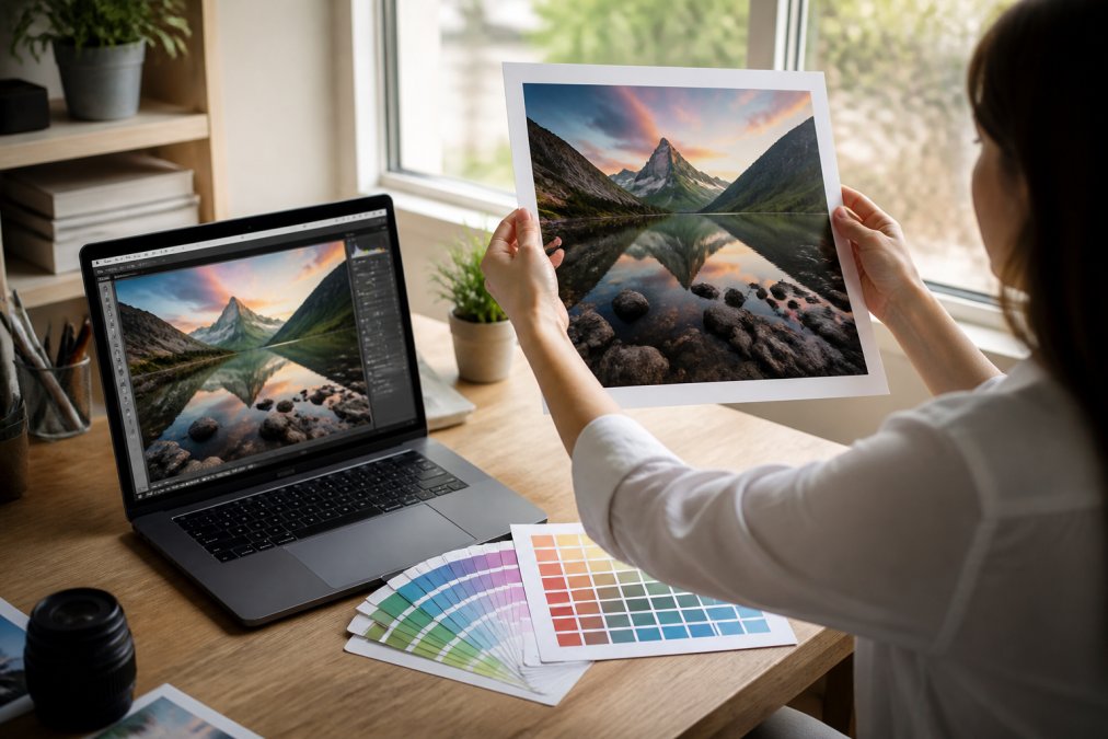
Checking print colour accuracy is a structured process, not a single action. Work through these steps in order. Skipping any one of them undermines the reliability of the others.
| Step | Action | Key Detail |
|---|---|---|
| 1 | Set up your colour profile | Convert RGB to CMYK using the correct output intent |
| 2 | Calibrate your monitor | Use a hardware colorimeter; recalibrate every 4-6 weeks |
| 3 | Soft proof and request a test print | Apply provider's ICC profile; check gamut warnings |
| 4 | Evaluate the physical print | Use D50 standard lighting; compare against a contract proof |
Step 1: Set Up Your Colour Profile Correctly
Before anything else, ensure your file is in the correct colour space for the intended print process. Convert from RGB to CMYK using the output profile supplied by your print provider, or use ISO Coated v2 if no profile is available. Do not leave this conversion to the printer's automatic processing. Check your document's colour mode in your design software before export.
Step 2: Calibrate Your Monitor
Run a full hardware calibration using a colorimeter, targeting a white point of D65 (6500K) and a gamma of 2.2 for most print workflows. Set your monitor brightness to approximately 80-100 cd/m², which more closely matches the luminance of a printed page under standard viewing conditions. Recalibrate every four to six weeks, or any time you move your monitor to a different environment.
Step 3: Run a Soft Proof and Request a Test Print
Apply your provider's ICC profile as a soft proof in your design software. Enable gamut warnings to identify any colours in your file that fall outside the printable range. Adjust those colours manually rather than letting the printer clip them automatically. Then request a physical test print, also called a contract proof, before approving the full run.
Step 4: Evaluate the Physical Print Under Correct Lighting
This step is where most people go wrong. Viewing a print under warm incandescent lighting, fluorescent office lights, or direct sunlight will all produce different colour perceptions. The industry standard for print evaluation is D50 lighting, which simulates noon daylight at 5,000 Kelvin. Dedicated viewing booths are available for professional use. At minimum, view your print in consistent, neutral daylight, away from coloured walls that can cast a tint onto the paper.
Compare the test print directly against your soft proof on the calibrated monitor, viewed side by side under D50 conditions. Document any deviations and communicate them to your provider before approving the final run.
Common Mistakes That Undermine Print Colour Accuracy
Most print colour failures trace back to a short list of avoidable errors. Recognising them is the first step to eliminating them.
Sending uncorrected RGB files. This is the most frequent mistake. The printer's automatic conversion will not match what you saw on screen.
Evaluating prints under mixed or uncontrolled lighting. A print viewed under warm office lighting will look different from the same print viewed under cool fluorescent light. Neither is accurate without a D50 reference.
Ignoring paper type. Different substrates absorb and reflect ink differently. Gloss paper produces more saturated, contrasty results. Uncoated stock appears softer and more muted. The same CMYK values will look visibly different on each. Research from the University of Manchester's Department of Textiles and Paper confirms that colour matching difficulties between screen and print are persistent even in professional and educational environments, and substrate variation is a primary contributing factor.
Recalibrating infrequently. Monitor drift is gradual and invisible. Many designers work for months on a display that has drifted significantly without noticing.
Skipping the test print. A soft proof is a simulation. A contract proof is a physical verification. For any colour-critical work, both are necessary.
What to Expect From a Quality Print Provider
A quality print provider treats colour management as a technical discipline, not a best-effort guess.
When evaluating a print provider, ask these questions:
- Do they use ICC profiles for each press and substrate combination?
- Can they provide contract proofs before a full run?
- Do they use spectrophotometers for closed-loop colour control during the press run?
- What colour standard do they print to? ISO 12647-2 is the relevant standard for offset and digital print in professional environments.
The digital print colour management market reflects how seriously the industry now takes this. According to a May 2026 market forecast, the global Digital Print Colour Management Solutions market was valued at USD 1,262 million in 2025 and is projected to reach USD 1,832 million by 2034, at a CAGR of 5.5%. Providers who are not investing in this infrastructure are falling behind.
For art prints specifically, where the product's entire value rests on its visual quality, colour management is non-negotiable. Pitch Black Print's travel posters are produced to exacting colour standards precisely because a print that misrepresents the warmth of a Lisbon afternoon or the clarity of an Icelandic sky is not the product we are selling.
Colour accuracy problems are not inevitable. They are the result of specific, correctable gaps in the workflow: uncalibrated monitors, uncontrolled conversions, inadequate proofing, and poor viewing conditions. Addressing each one systematically is how you move from hoping a print looks right to knowing it will. Pitch Black Print's original travel poster collection is produced with this level of care, with professional framing options in black, white, or oak, free worldwide shipping, and a 14-day return policy so you can order with confidence. Browse the collection and bring home a print that looks exactly as it should.
Frequently Asked Questions
Why do my prints look different to my screen?
Screens produce colour using light (RGB), which generates over 16 million shades. Printers use ink on paper (CMYK), which can reproduce roughly 16,000 shades. This narrower colour gamut means vibrant on-screen colours often appear more muted when printed. An uncalibrated monitor compounds the problem by showing colours that don't reflect what any printer can actually output. Converting your file to CMYK before sending it to print, and soft proofing in design software, both reduce the gap significantly.
How do I calibrate my monitor for print accuracy?
Use a hardware colorimeter to measure your screen's actual output and generate an ICC profile your operating system applies automatically. Devices like the X-Rite i1Display are widely used for this. In 2026, some high-end monitors include AI-assisted auto-calibration that corrects colour drift without a separate device. After calibrating, set your monitor's white point to D50 or D65 and your brightness to around 120 cd/m², which better matches viewing conditions for print work.
What is the difference between RGB and CMYK for printing?
RGB (Red, Green, Blue) is an additive colour model used by screens; colours are created by mixing light. CMYK (Cyan, Magenta, Yellow, Black) is a subtractive model used by printers; colours are created by layering inks on a reflective surface. Because CMYK has a smaller colour gamut than RGB, some saturated blues, greens, and oranges visible on screen cannot be reproduced in print. Designing in CMYK from the start, or converting carefully before sending files, gives you print colour accuracy from the outset.
How can I check if my printer is producing accurate colours?
Print a standardised test page or a colour chart and compare it against a known reference, such as a Pantone swatch book or a certified contract proof. Evaluate the result under a D50 standard viewing light (5,000 K), not ordinary room lighting, which shifts perception. If specific brand or Pantone colours matter, check whether your printer is Pantone-licensed.
This article was written using GrandRanker