
Best Travel Posters for Gallery Walls
Table of Contents
- Why Travel Posters Transform Gallery Walls
- How to Arrange a Gallery Wall with Travel Posters
- Affordable Travel Art for Home: Styles That Work
- Curated Travel Posters for Every Destination
- Choosing Colours and Themes for Cohesion
- Frame Options and Display Flexibility
- Frequently Asked Questions
Why Travel Posters Transform Gallery Walls
Travel posters have become a legitimate design statement. According to the Buildworld survey on homeowner art preferences, 62% of homeowners chose photography and travel-themed artwork for their walls, with nearly half placing art in every room of their homes. Unlike generic abstract prints, travel posters carry narrative weight, they commemorate places you've been, spark wanderlust, and create conversation points. A well-chosen travel poster anchors a room's entire aesthetic, setting mood, defining colour palette, and giving your home earned personality.
Contemporary gallery walls embrace the "eclectic collector" vibe: mixed frame styles, varied sizes, and a sense that pieces have been gathered over years. This flexibility makes travel posters ideal because they naturally encourage this lived-in aesthetic.
At Pitch Black Print, we specialise in original travel posters designed specifically for gallery arrangements. Our collection spans minimalist line art, vibrant contemporary designs, and vintage-inspired prints, each crafted to work beautifully in curated arrangements.
How to Arrange a Gallery Wall with Travel Posters
Arranging a gallery wall with travel posters requires strategy, but the process is straightforward once you understand core principles. Interior stylist Joanna Thornhill emphasises placement: "The key is keep the central piece of your gallery wall hung at your eye-line, then everything else should be hung above, down and around that point, rather than starting your gallery wall two metres above your sofa."
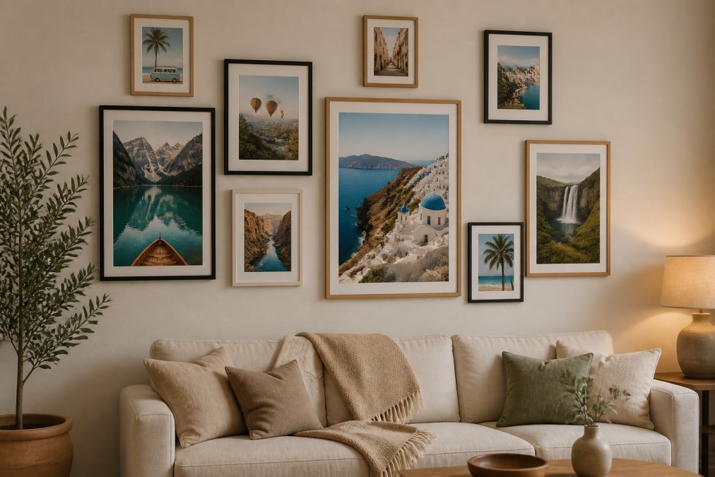
Start with a focal point
Every successful gallery wall needs an anchor, typically your largest piece or the one with strongest visual impact. Position this piece at eye level, roughly 145 centimetres from the floor to the centre of the frame. Everything else orbits around this central piece, building outward and upward.
The focal point sets the tone for the entire arrangement. If you choose a vibrant contemporary poster like the Menorca Travel Poster with its geometric low-poly pool scene, you've established a bold, energetic aesthetic. Pair it with complementary pieces that echo its colour palette rather than fight against it.
Mix sizes and frame styles
Interior designer Katharine Pooley notes that thoughtful curation transforms a collection into a cohesive statement: "Always lay your art out on the floor before starting to hang and group the pictures together, then you'll be able to assess whether they complement each other or clash, and you can move them around according to your style."
Mixing frame styles creates visual rhythm. Black frames feel contemporary and grounding. White frames feel fresh and Scandinavian. Oak frames bring warmth and a collected-over-time quality. Choose frames that share a finish quality, all matte or all glossy, even if colours differ.
Vary poster sizes strategically. Anchor your focal point with a larger piece (A2 or A1 size), then surround it with smaller prints (A4 or A3). This creates visual movement and prevents static uniformity.
Plan your layout on the floor first
Before drilling a single hole, lay out your entire arrangement on the floor or kraft paper taped to the wall. Photograph your layout from above as your hanging guide. Measure spacing between pieces and verify that your focal point sits at eye level relative to where people will stand or sit.
This planning stage reveals that slightly asymmetrical arrangements work better than perfectly symmetrical ones. Real gallery walls look better with pieces clustered in organic groupings rather than evenly distributed.
Affordable Travel Art for Home: Styles That Work
Travel posters come in distinct aesthetic categories. Understanding these styles helps you choose pieces that genuinely work in your space.
Minimalist line art posters
Minimalist line art features single-colour line drawings, typically black on cream, that capture iconic destinations with elegant simplicity. The London Travel Poster featuring Big Ben and the Palace of Westminster exemplifies this approach, rendering architectural landmarks with fine linework that feels sophisticated and understated.

The advantage is neutrality. These pieces work in virtually any interior scheme because they don't impose a colour story. Minimalist posters excel in home offices, studies, and bedrooms where visual calm matters. They don't compete for attention; instead, they provide elegant visual interest without overstimulation.
The Central Park New York City Poster with its minimalist line art approach demonstrates how this style captures complex scenes without becoming visually cluttered.
Vintage retro travel prints
Vintage-style travel posters use period-appropriate colour palettes, rich ambers, deep teals, burnt oranges, and typography evoking mid-century design. The Tower Bridge London Vintage Travel Poster captures this aesthetic perfectly, with navy, amber, and crimson tones beneath a dramatic sunset sky.

Vintage posters work best as dominant visual elements. Because they carry strong colour and nostalgic energy, they need space to breathe. Multiple vintage pieces create a cohesive, intentional gallery wall that feels like a curated collection from a 1950s travel agency.
These pieces suit living rooms and hallways where you want warmth and personality. They're particularly effective with mid-century modern furniture, warm wood tones, or vintage décor. Vintage aesthetics have proven staying power and age beautifully.
Contemporary paper-cut art
Paper-cut style posters use layered colours and sculptural depth to create rich, dimensional scenes. The Colosseum Rome Poster with its paper-cut illustration demonstrates the technique: warm golden sunlight bursts through ancient arches, with layered clouds and cypress trees creating depth across amber and blue tones.
Paper-cut posters make bold statements and demand to be seen. A single piece can anchor an entire room's aesthetic, making them ideal for spaces where you want strong visual impact without cluttering walls. They work exceptionally well in living rooms, bedrooms, and creative spaces.
The colour richness means they work best with complementary interiors. A warm, golden paper-cut poster pairs beautifully with cream walls, natural wood, and warm lighting.
Curated Travel Posters for Every Destination
The destinations you choose should reflect places that matter to you personally. Certain categories work particularly well because they carry universal appeal and strong visual characteristics.
Iconic European landmarks
European landmarks resonate across cultures because they carry historical weight and instantly recognisable visual signatures. The Tower Bridge London Poster in paper-cut style with its deep purple, magenta, and burnt orange layers exemplifies this appeal. European city landmarks create a sense of sophistication and cultural literacy without appearing pretentious.

The Colosseum Rome Poster in minimalist line art offers a different approach to the same destination. The minimalist rendering feels scholarly and refined, perfect for studies or libraries. The same landmark works in multiple aesthetic styles, giving you flexibility when building mixed-style gallery walls.
European landmarks benefit from established colour associations. London evokes navy and gold. Rome suggests warm amber and terracotta. These colour traditions mean European landmark posters naturally coordinate with each other and existing home décor.
Coastal and beach destinations
Beach and coastal destinations bring relaxation and wanderlust into your home. The Majorca Vintage Travel Poster with its glowing sunset over the Mediterranean captures the essence of Mediterranean leisure. The teal and amber colour palette creates warmth and escapism.
Coastal posters work particularly well in bedrooms, bathrooms, and relaxation spaces. They're ideal for homes near actual coastlines, where they create visual continuity between interior and landscape. The Menorca Travel Poster with its geometric pool scene offers a contemporary take on beach destinations, perfect for homes with contemporary décor.
Coastal posters work beautifully in series. A gallery wall featuring multiple beach destinations creates a cohesive travel narrative, with pieces naturally coordinating through shared colour families and thematic elements.
Urban skylines and city scenes
City skylines bring energy and sophistication into spaces. The Central Park New York City Poster captures Manhattan's iconic silhouette with minimalist elegance. Urban posters work in home offices, studies, and living spaces where you want to evoke creativity and ambition.
City posters are particularly effective in gallery walls because skyline drawings naturally lead the eye upward and across the composition, creating dynamic energy. Multiple city posters in a gallery arrangement create visual rhythm and sophistication.
Urban destinations appeal to a broad audience. Whether someone has visited New York, London, or Rome, they recognise the iconic skyline. This universal recognition means city posters work as conversation pieces and visual anchors.
Choosing Colours and Themes for Cohesion
A successful gallery wall requires visual cohesion, and colour is your primary tool. Choose a dominant colour family and allow variation within it. If you select warm posters, amber, terracotta, golden tones, then add complementary pieces in deep blues or forest greens, you create visual harmony.
Alternatively, build your gallery wall around a neutral base. Minimalist line art posters on cream backgrounds act as visual anchors that allow you to introduce bolder, more colourful pieces without overwhelming the space.
Consider your existing room colours when selecting posters. Warm cream or soft grey walls pair beautifully with vintage-style posters with rich amber tones. Bright white or cool grey walls suit minimalist line art or contemporary paper-cut designs with jewel tones.
Thematic cohesion matters as much as colour. A gallery wall featuring exclusively European landmarks feels more curated than a random mix of destinations. Interior designer Elizabeth Bennett emphasises: "If you are striving for a collected, artistic space with some eclectic elements, a traditional gallery wall of mixed media and frame styles will instantly hit the mark."
Frame Options and Display Flexibility
The frame you choose transforms a poster's impact. Pitch Black Print offers three frame finishes, black, white, and oak, plus the option to purchase posters unframed.
Black frames feel contemporary, grounding, and sophisticated. They work particularly well with minimalist line art posters and in modern interiors, creating strong visual definition.
White frames feel fresh, Scandinavian, and light. They work beautifully with vintage-style posters and in bright, airy spaces. White frames recede visually, allowing poster imagery to take centre stage.
Oak frames bring warmth and a natural, collected-over-time quality. They work in traditional, eclectic, and warm-toned interiors, suggesting posters have been thoughtfully gathered over years.
Unframed posters offer maximum flexibility. You can frame them yourself using existing frames or frame them later as your budget allows. This approach also works if you're renting and want to avoid permanent wall damage.
All Pitch Black Print posters are printed on premium heavyweight matte paper, holding up beautifully whether framed or unframed. The matte finish eliminates glare and creates a sophisticated, gallery-quality appearance.
Creating a gallery wall with travel posters is fundamentally about surrounding yourself with places and memories that matter to you. The technical aspects, sizing, spacing, frame selection, serve a larger purpose: transforming blank wall space into a personal narrative.
The most successful gallery walls reflect genuine taste and intentional curation. Whether you choose minimalist line art, vintage posters, or contemporary paper-cut designs, your selections should feel authentic to your aesthetic.
Pitch Black Print's collection makes this process accessible. With original designs spanning multiple styles, destinations, and price points, all starting at £14.99, you can build a gallery wall that feels curated and personal without substantial investment (smart online shopping guide). The 14-day return policy means you can order with confidence, knowing you can adjust selections if pieces don't work in your space. Free worldwide shipping removes the barrier to experimentation.
Your walls deserve art that tells your story. Start with one focal piece, add complementary posters gradually, and let your gallery wall evolve as your taste and travels do.
=== FAQ ANSWERS (audit these too, same rules) ===
[1] Q: How do you arrange travel posters on a gallery wall? A: Start by laying all your travel posters on the floor and grouping them by theme or colour palette. Identify your focal point, typically the largest piece or most visually striking poster, and hang it at eye level (around 152 centimetres from the floor). Arrange remaining pieces above, below, and around this anchor point rather than in rigid rows. Leave consistent spacing of 5-8 centimetres between frames. Interior stylist Joanna Thornhill advises keeping the central piece at eye-line height to ensure the entire gallery wall relates visually to the furniture in the room.
[2] Q: What sizes work best for travel poster gallery walls? A: Mix sizes to create visual interest and prevent monotony. Combine A4 (210 × 297 millimetres) and A3 (297 × 420 millimetres) prints with larger statement pieces like A2 (420 × 594 millimetres) to anchor the composition. Avoid using only identical sizes, as this can feel too uniform and dated. Pitch Black Print offers sizes ranging from A5 to A1, allowing flexibility to create dynamic arrangements.
[3] Q: Are vintage travel posters better than modern designs for gallery walls? A: Both work beautifully depending on your aesthetic and home style. Vintage retro travel posters suit eclectic, collected-over-time looks and add warmth to modern rooms through nostalgia and familiar imagery. Contemporary designs, including minimalist line art and paper-cut styles, offer clean lines that pair well with Scandinavian or modern interiors. The 2026 interior design trend emphasises the 'eclectic collector' vibe, mixing vintage and contemporary pieces to create a gallery wall that looks gathered over years of travel. Choose based on your existing décor and personal taste rather than trend alone.
[4] Q: Can you return travel posters if they don't match your décor? A: Yes, Pitch Black Print offers a 14-day return policy, so you can order with confidence. If a print arrives and doesn't look right on your wall, whether due to colour variation, size, or style, you can return it in its original condition. This is especially helpful when buying online, as screen colours can differ from the finished print. The company also provides poster-only options without framing, allowing you to test colours and placement before committing to frames, and offers black, white, and oak frame finishes to match any décor.
[5] Q: What's the difference between framed and unframed travel posters? A: Unframed posters (print-only) offer flexibility and affordability, you can choose your own frames or use clips and tape, making them ideal for renters. Framed options from Pitch Black Print arrive ready to hang in black, white, or oak finishes, eliminating extra steps and ensuring professional presentation. Framed posters also protect prints from dust and damage. If you're renting or unsure about your final design, start with unframed prints at £14.99. Once you're certain of placement and style, upgrade to framed versions for a polished, gallery-ready look.
Frequently Asked Questions
Q: How do you arrange travel posters on a gallery wall?
A: Start by laying all your travel posters on the floor and grouping them by theme or colour palette. Identify your focal point, typically the largest piece or most visually striking poster, and hang it at eye level (around 152 centimetres from the floor). Arrange remaining pieces above, below, and around this anchor point rather than in rigid rows. Leave consistent spacing of 5-8 centimetres between frames. Interior stylist Joanna Thornhill advises keeping the central piece at eye-line height to ensure the entire gallery wall relates visually to the furniture in the room.
Q: What sizes work best for travel poster gallery walls?
A: Mix sizes to create visual interest and prevent monotony. Combine A4 (210 × 297 millimetres) and A3 (297 × 420 millimetres) prints with larger statement pieces like A2 (420 × 594 millimetres) to anchor the composition. Avoid using only identical sizes, as this can feel too uniform and dated. Pitch Black Print offers sizes ranging from A5 to A1, allowing flexibility to create dynamic arrangements.
Q: Are vintage travel posters better than modern designs for gallery walls?
A: Both work beautifully depending on your aesthetic and home style. Vintage retro travel posters suit eclectic, collected-over-time looks and add warmth to modern rooms through nostalgia and familiar imagery. Contemporary designs, including minimalist line art and paper-cut styles, offer clean lines that pair well with Scandinavian or modern interiors. The 2026 interior design trend emphasises the 'eclectic collector' vibe, mixing vintage and contemporary pieces to create a gallery wall that looks gathered over years of travel. Choose based on your existing décor and personal taste rather than trend alone.
Q: Can you return travel posters if they don't match your décor?
A: Yes, Pitch Black Print offers a 14-day return policy, so you can order with confidence. If a print arrives and doesn't look right on your wall, whether due to colour variation, size, or style, you can return it in its original condition. This is especially helpful when buying online, as screen colours can differ from the finished print. The company also provides poster-only options without framing, allowing you to test colours and placement before committing to frames, and offers black, white, and oak frame finishes to match any décor.
Q: What's the difference between framed and unframed travel posters?
A: Unframed posters (print-only) offer flexibility and affordability, you can choose your own frames or use clips and tape, making them ideal for renters. Framed options from Pitch Black Print arrive ready to hang in black, white, or oak finishes, eliminating extra steps and ensuring professional presentation. Framed posters also protect prints from dust and damage. If you're renting or unsure about your final design, start with unframed prints at £14.99. Once you're certain of placement and style, upgrade to framed versions for a polished, gallery-ready look.
This article was written using GrandRanker